Construction Project Management Dashboard
Overview
This project is an internal project management platform for a medium-scale real estate development company. Born out of the client’s need to centrally manage cost itemization, I recommended expanding the scope to create an overarching project management platform.
The business previously utilized paper documentation and local folders as their main organizational system. By observing their workflow and investigating explicit pain points, I reached the conclusion that a fully integrated management platform would best serve their needs.
Role + Scope
| I was hired as an independent designer to consult on the development of this platform. As such, I brought an external lens to the challenges and requirements of this project. I worked closely with project managers and in-house IT for the duration of the project. |
The scope of the project was to conduct user research and create a full suite of mockup views for the platform. Afterwards, my designs would be handed off to a third-party software development team to be implemented.
User Research
Because this project management platform was being developed in-house, I was able to conduct in-depth user interviews to assess the needs of users (project managers, executives, and accountants). This situation also allowed me to quickly conduct field testing between design revisions.
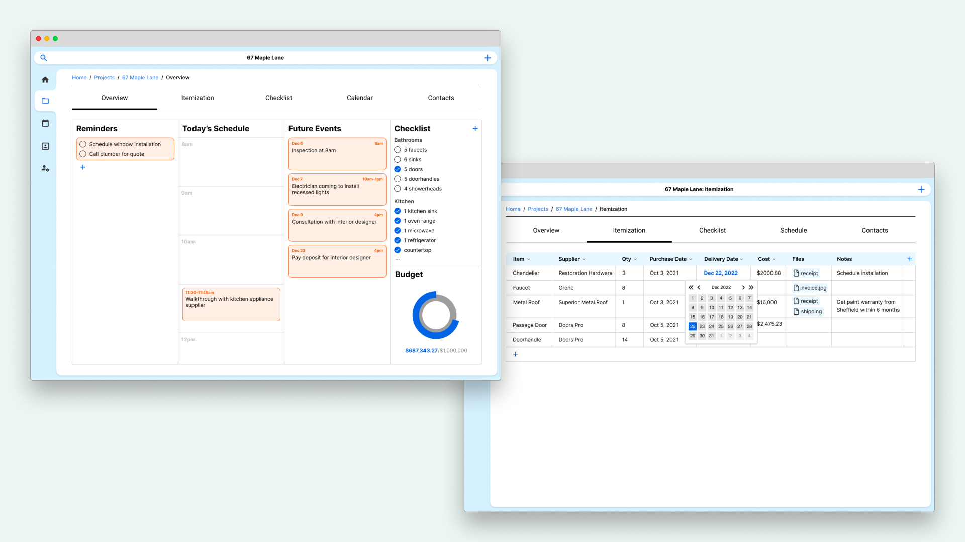
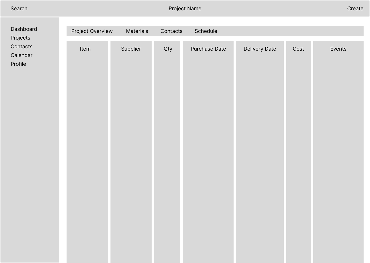
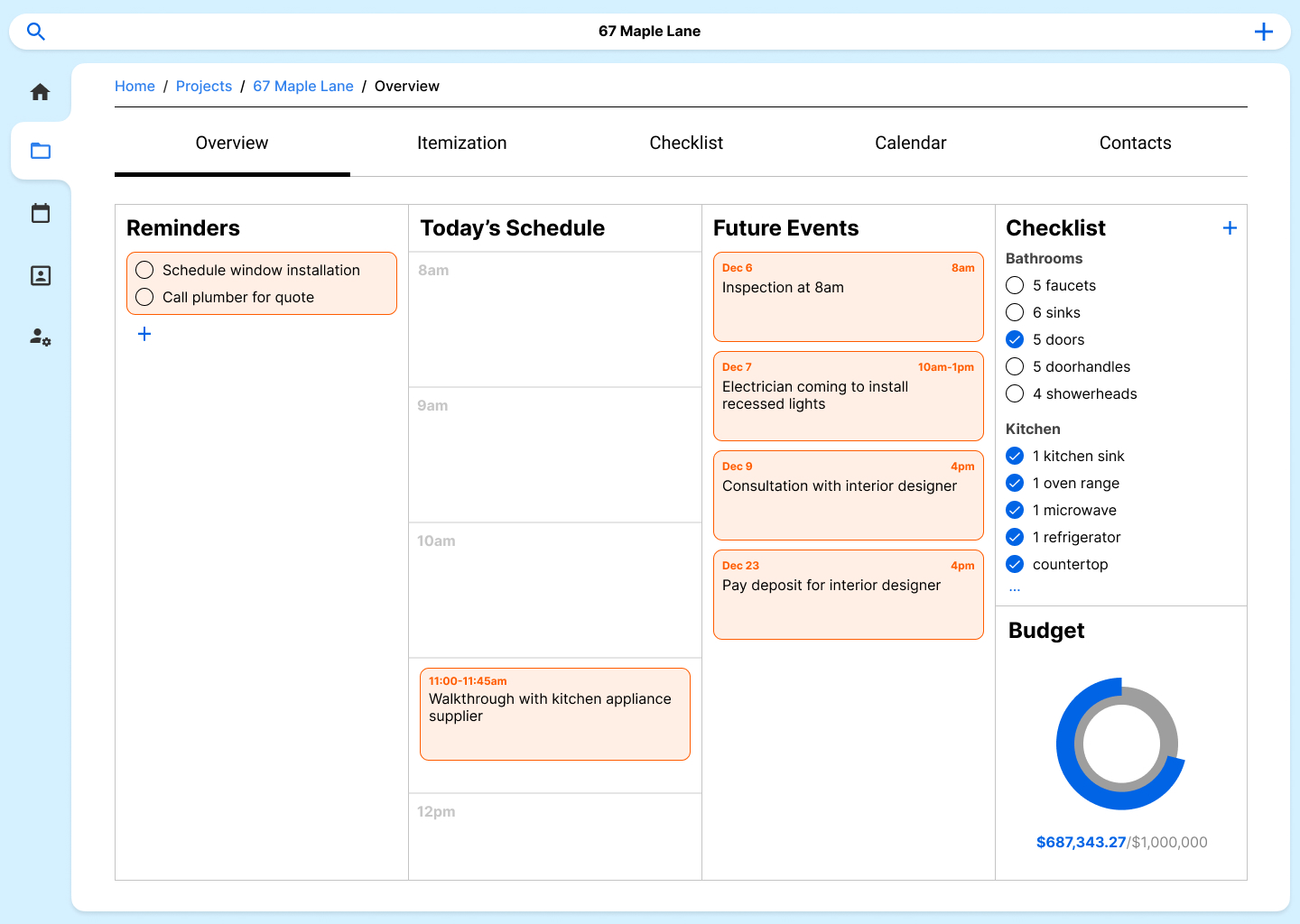
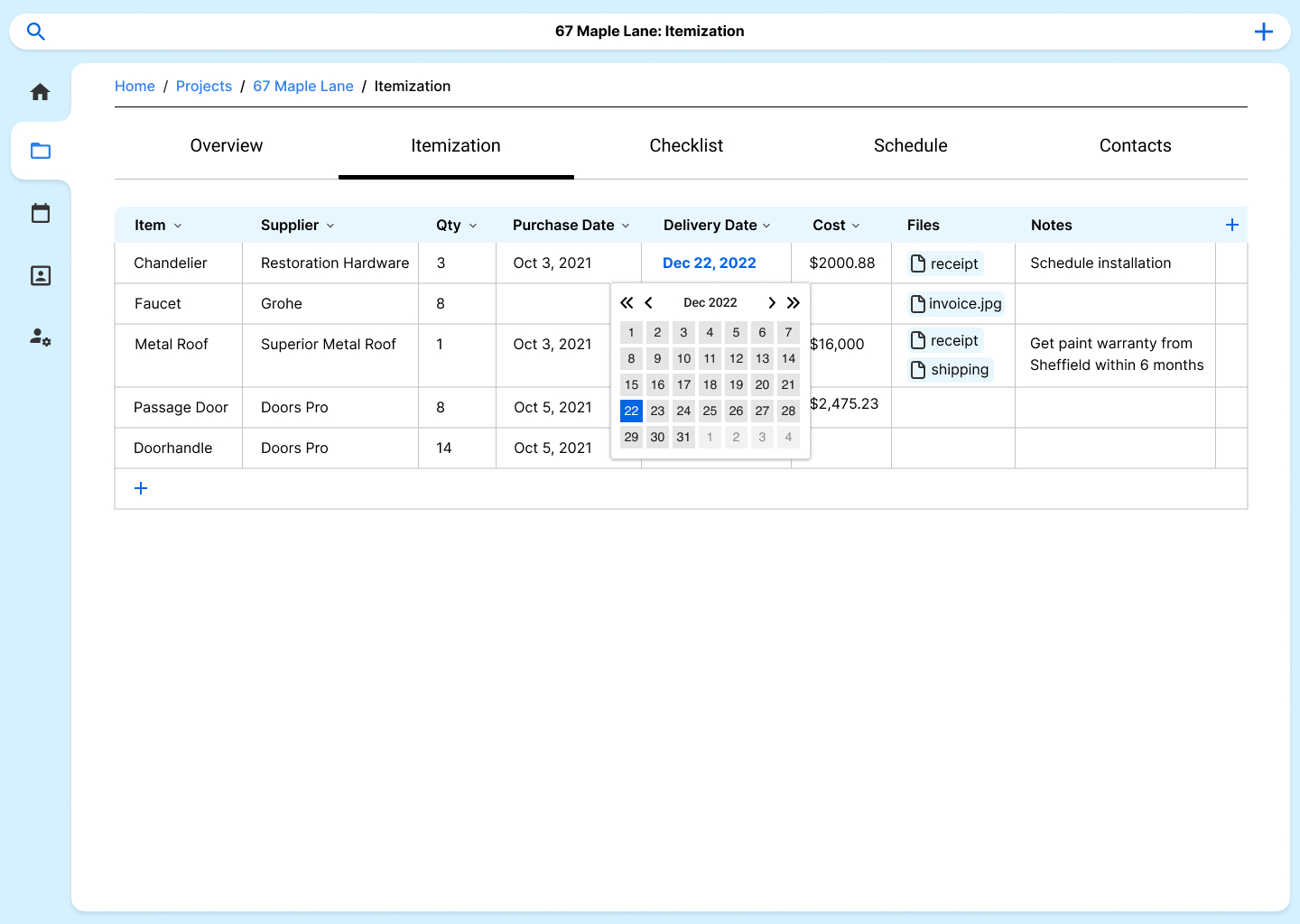
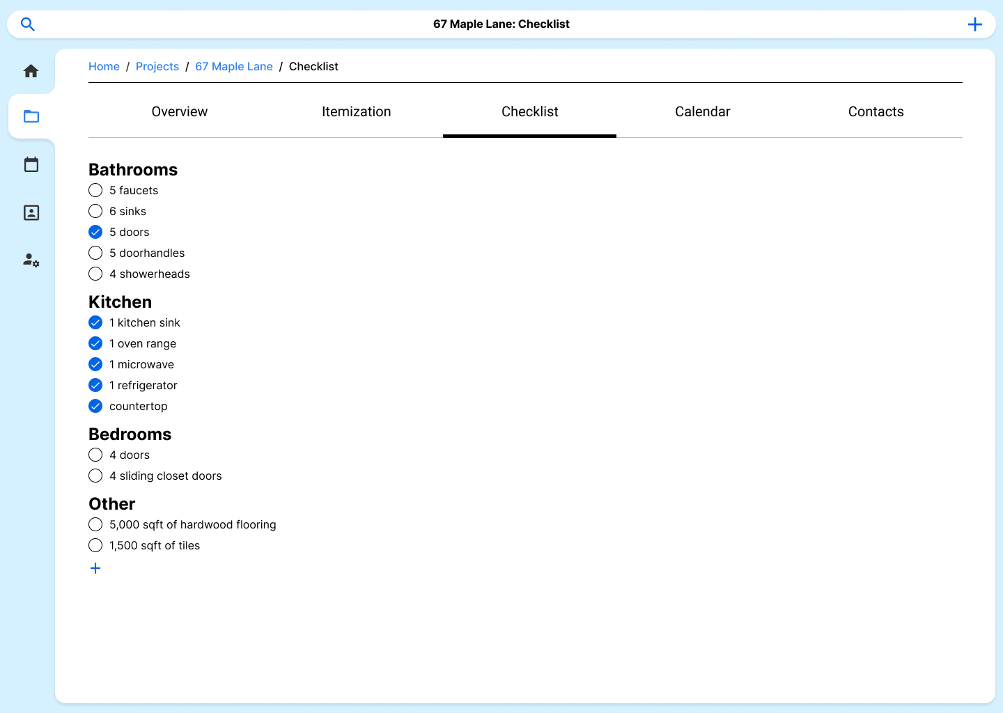
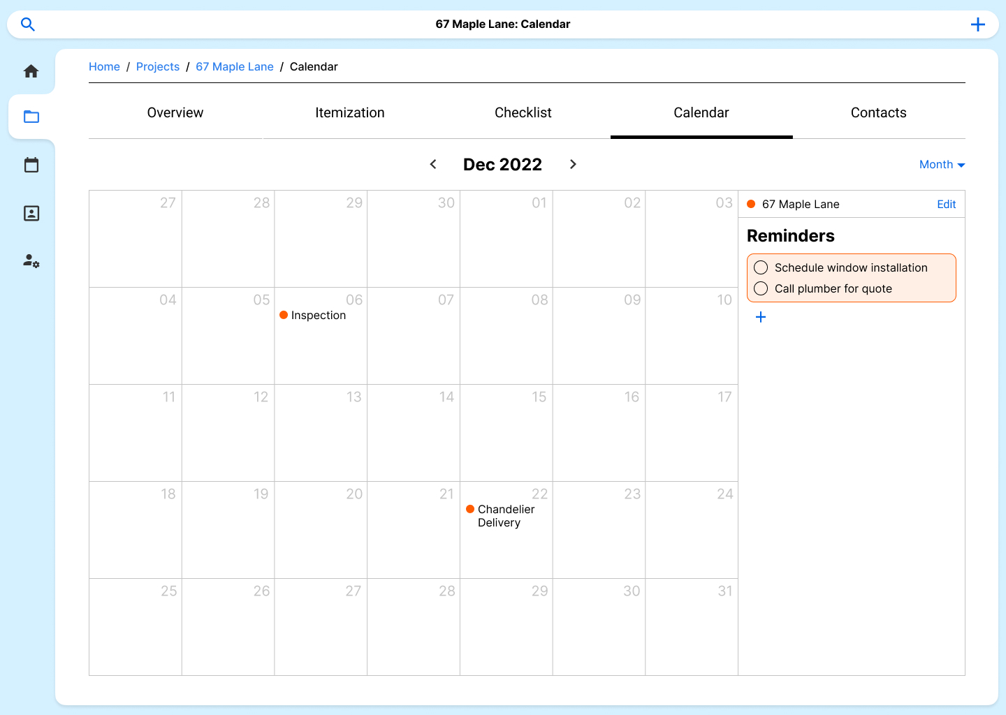
One problem I found in the initial design was that users would use the itemization tool as a checklist to remind themselves of what needed to be ordered. I added an additional tab that would allow users to manage project checklists in order to streamline the cost management feature. Moreover, the checklist would become a core view on the project overview page.
![]()
Design Ideation
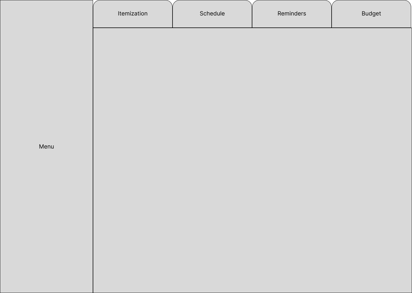
| I began with a simple tabbed framework to visually segment the features. The core functions are cost management, scheduling, and reminders. Each tab would allow the client to access different information for each construction project. |
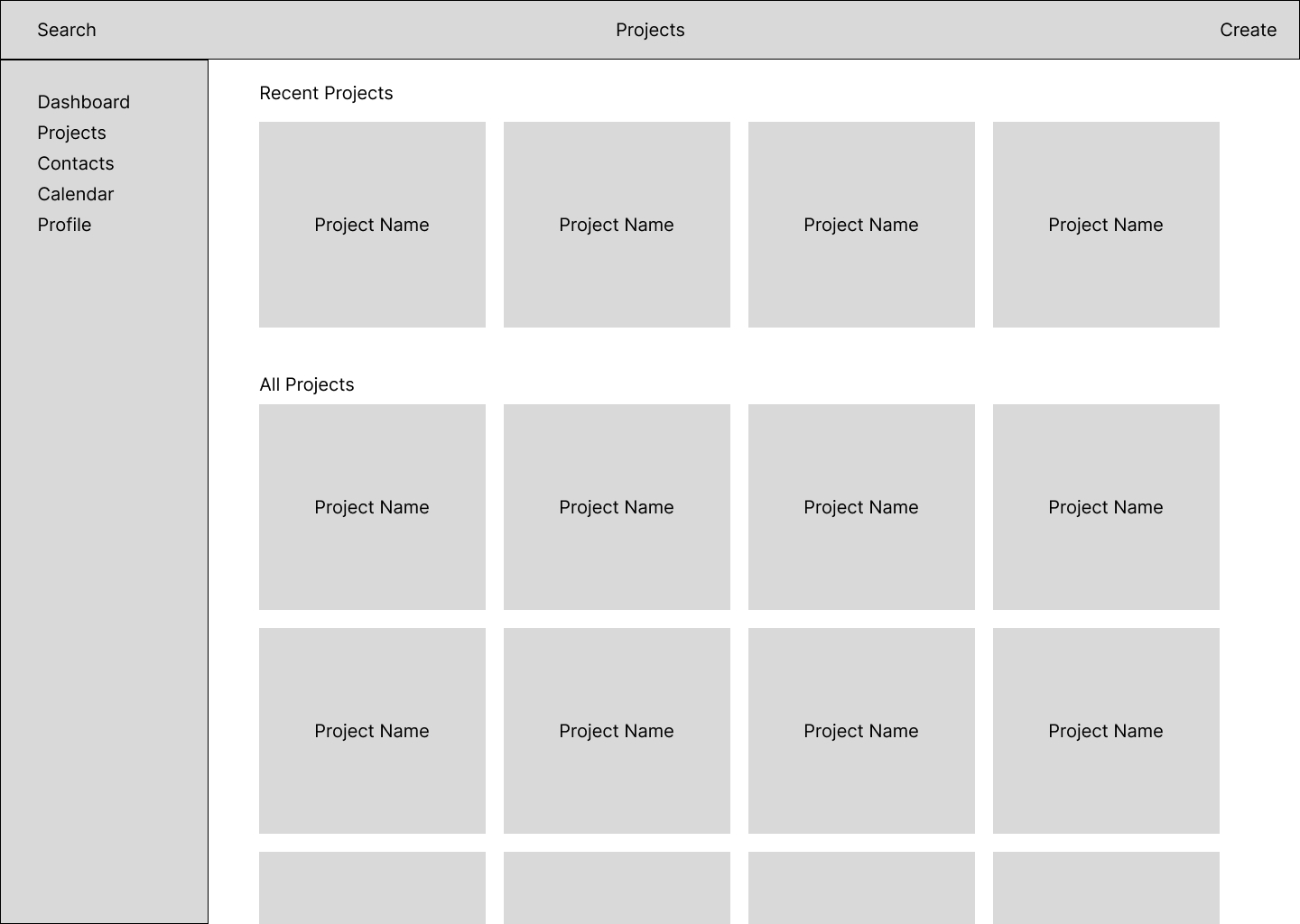
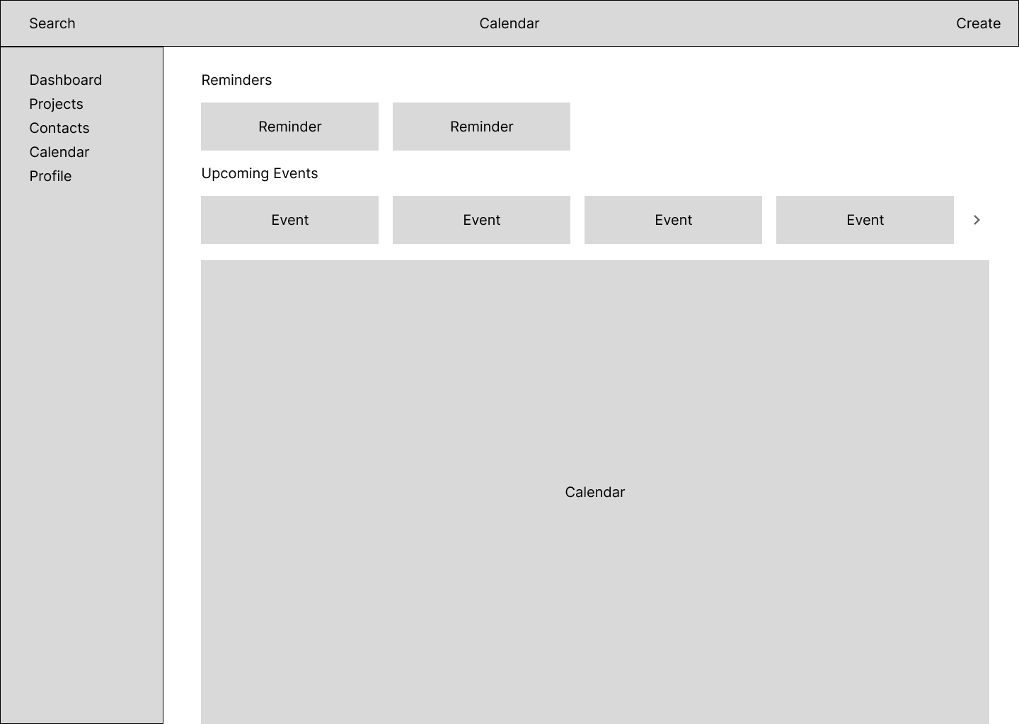
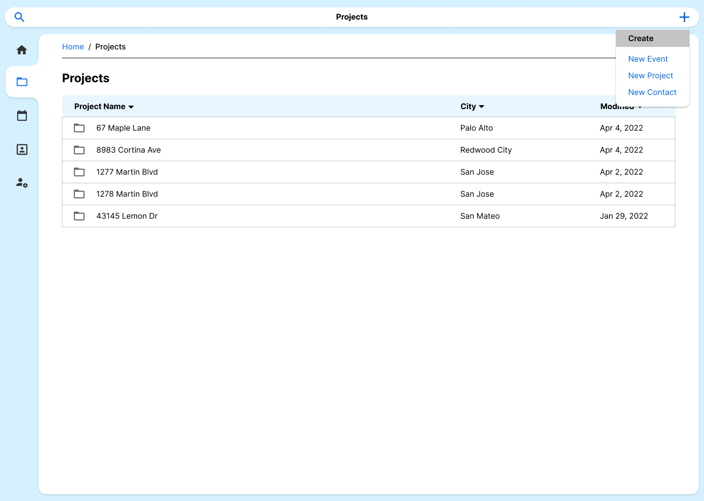
Early in the design process, I realized that we needed to complicate the navigation system in order to efficiently access the sheer number of construction projects. By adding a navigation bar, I created a way to navigate and frame the various UI views. From there, I laid out the various pages in low-fidelity mockups.

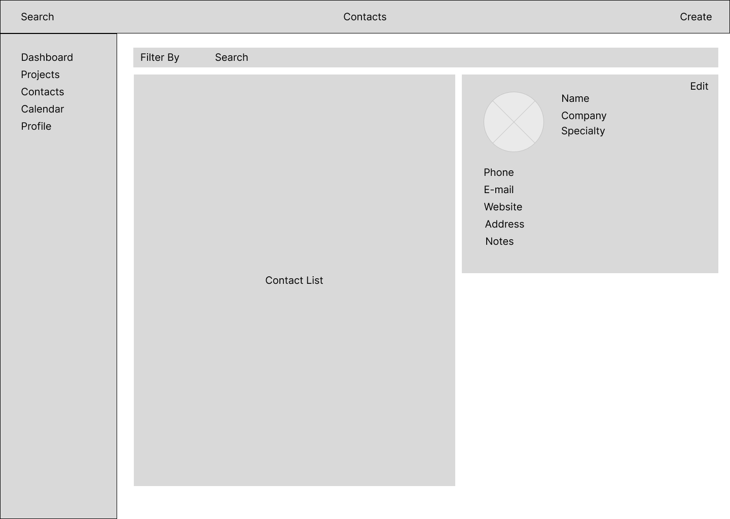
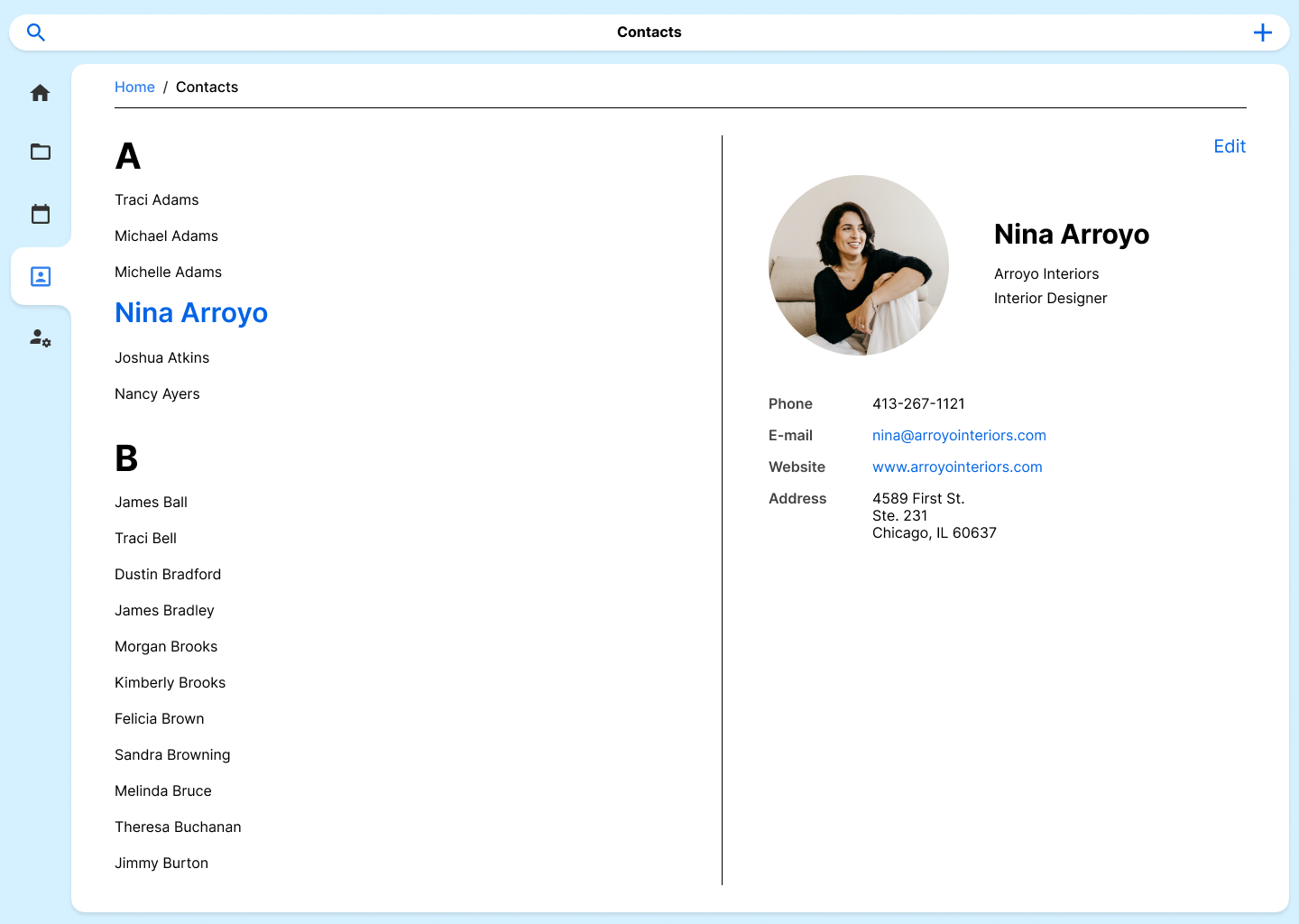
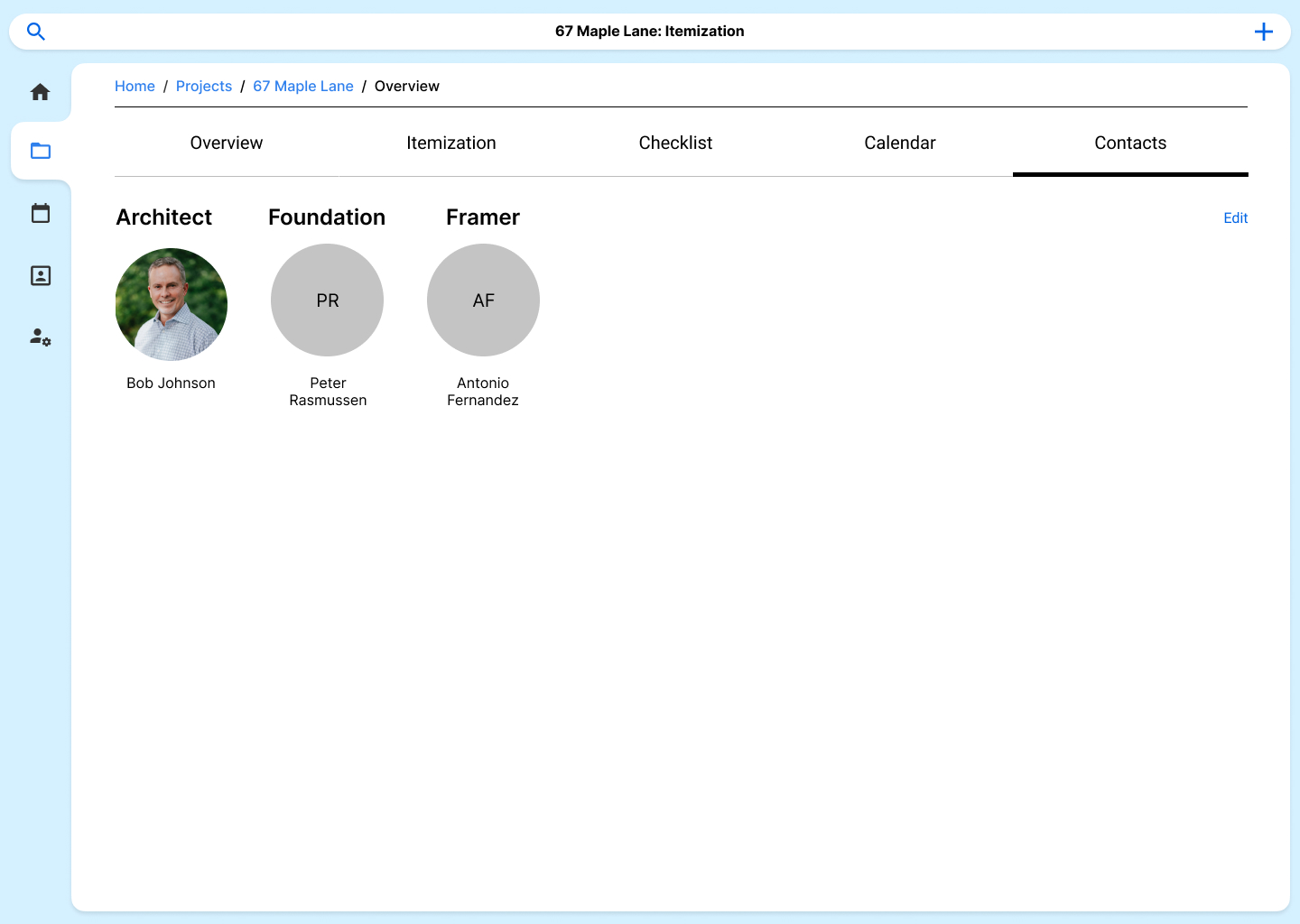
I am a proponent of following design heuristics in order to create intuitive experiences. As such, I chose to iterate on existing layouts for filesystems, spreadsheets, and calendars. This would also make it easier for the company to integrate the contact and calendar system with their existing database on Google.

Final Design
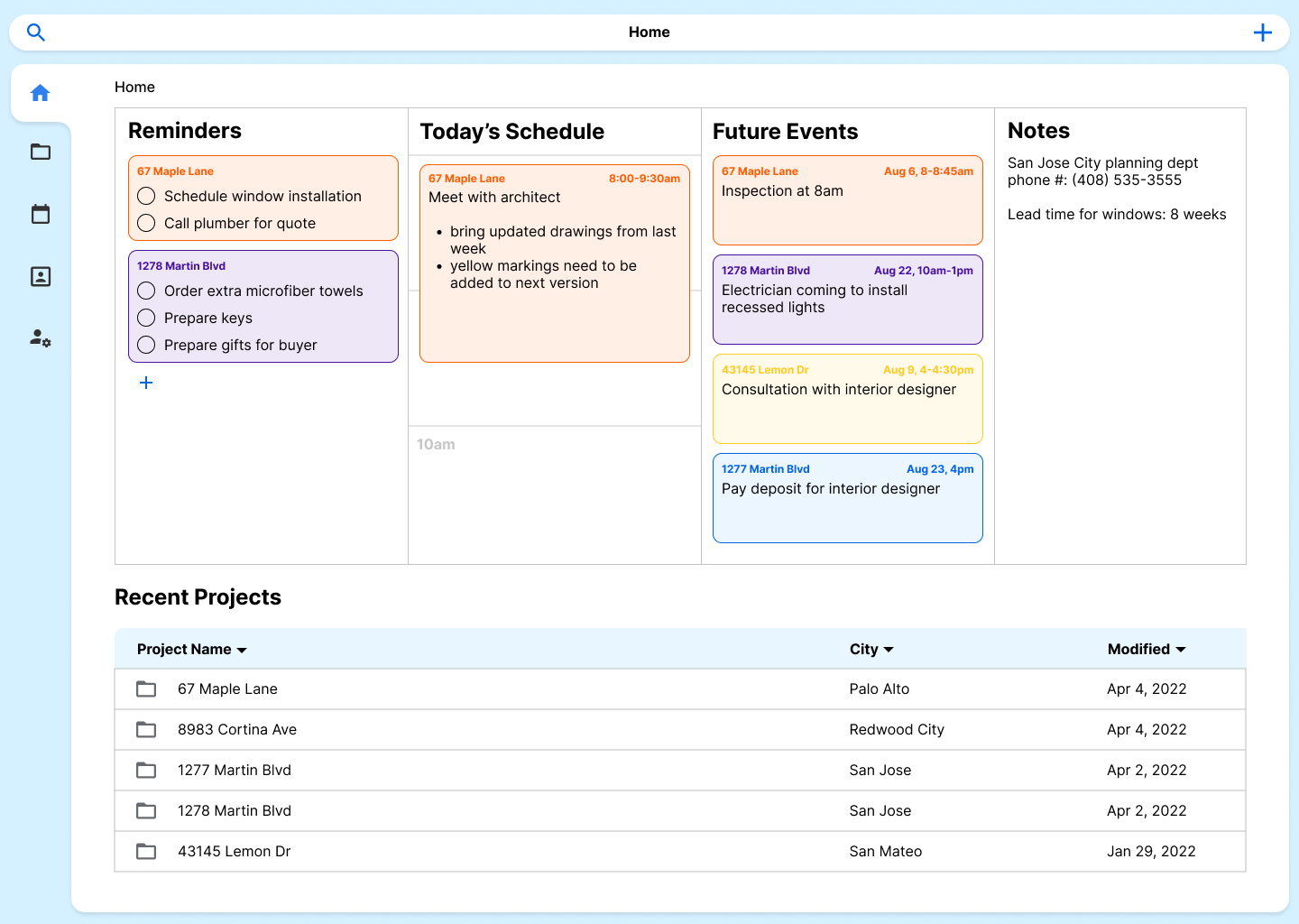
Due to the text-heavy nature of the platform, I opted to use icons in the side and top navigation areas. This allows the main navigation elements to recede into the background when not being used, prioritizing any text content in the center region. Additionally, I reused the multi-column view in the project overview page in the dashboard home and calendar views to create a consistent logic.
After two rounds of design revisions, I finalized the design system and implemented it across the all UI views.

Reflection
For me, this project amounted to one of the most comprehensive business-oriented UI/UX design projects I have worked on. The specific use-case made it an extremely technical design. I really enjoyed the deep dive into the industry and learning about the company’s needs. Spending time before the design ideation process to fully learn the users’ needs helped streamline the design process and minimize the back-and-forth typical of such a comprehensive design system.
At the end of the day, user-driven focus is what ultimately led to a highly functional yet visually appealing design.